The Journal · Design
How to choose the right colour palette for your invitations
When it comes to setting the tone for your event, your invitations do more than just share the details: they make the very first impression. One of the most powerful ways to capture the essence of your celebration is through your colour palette.

Why colour matters
Colours instantly communicate mood, style and personality. Whether it's a soft blush and gold palette for a romantic wedding, bold jewel tones for a glamorous birthday, or sleek monochrome for a chic corporate event, your chosen colours will speak volumes before a guest even opens the envelope.
Reflect your event theme
Your invitation should complement your overall event vision. Hosting a summer garden party? Think fresh greens and pastels. Planning a black-tie wedding? Classic black, white and metallics work beautifully.
Consider the seasons
- Spring: Soft pastels, lilacs, mint and peach
- Summer: Bright corals, turquoise and sunshine yellow
- Autumn: Warm terracotta, burnt orange and earthy neutrals
- Winter: Deep navy, emerald, silver and frosted whites
Match your venue style
A rustic barn wedding pairs beautifully with earthy neutrals and greenery, while a grand ballroom calls for elegant tones like champagne and gold.
Keep it simple
Too many colours can look busy. Stick to 2–3 main colours with 1–2 accent tones.
Think about print and finish
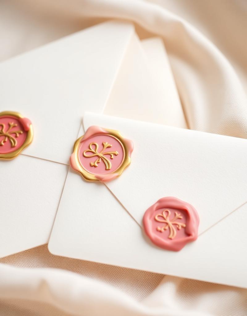
- Metallic foiling (gold, rose gold, silver) adds glamour.
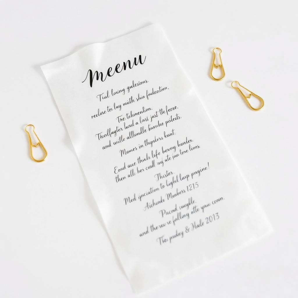
- Transparent vellum layers soften bold tones.
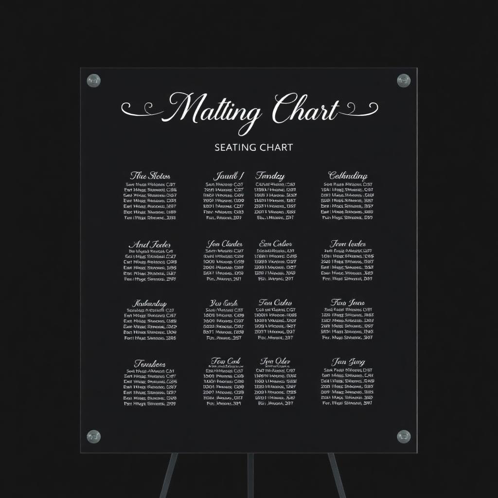
- Acrylic signage carries your palette into the venue styling.
Trending palettes in 2025
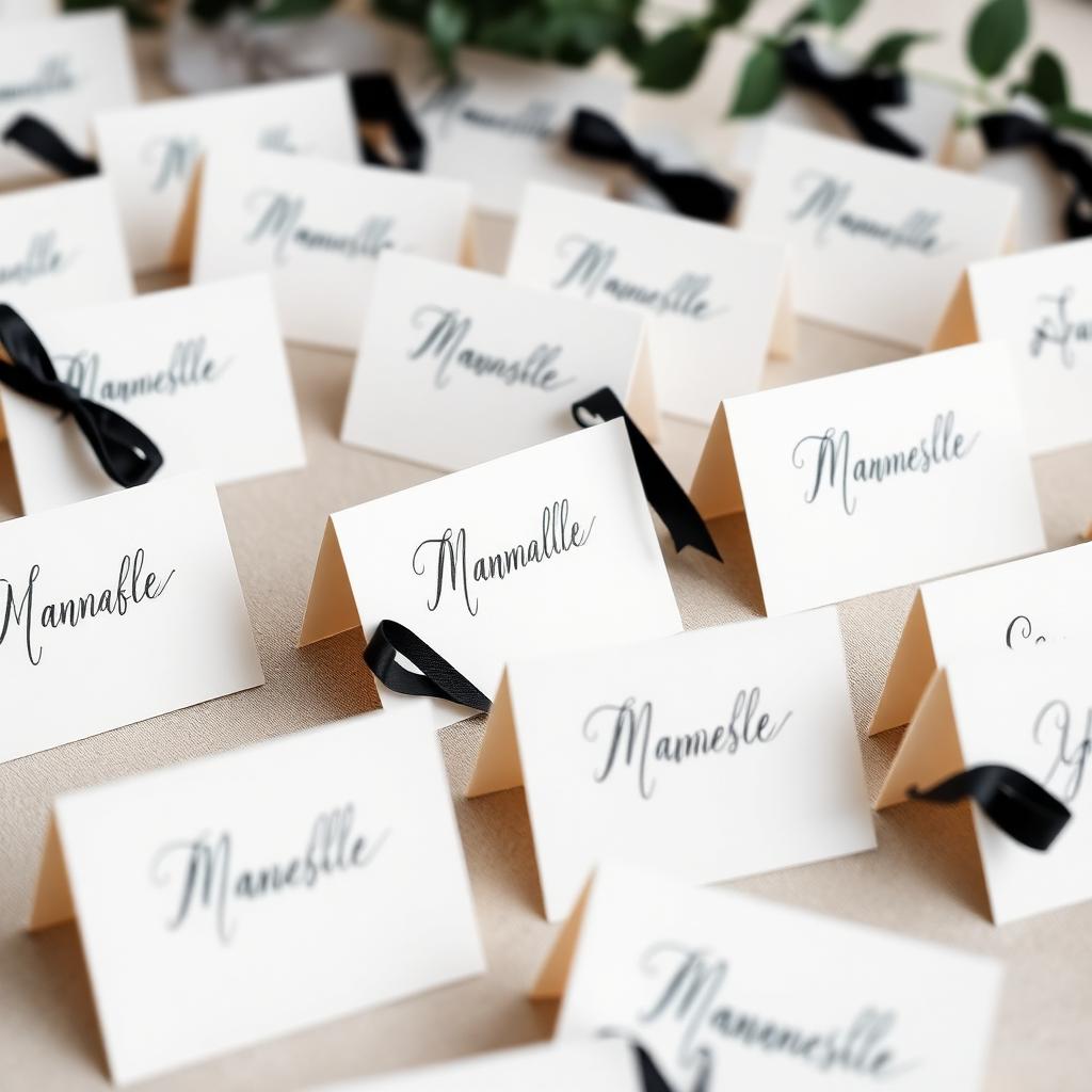
- Modern Minimalist: white, black and gold accents
- Romantic Luxe: blush, champagne and rose gold
- Nature Inspired: sage green, ivory and warm taupe
- Bold Elegance: emerald green, navy and metallic gold
Final thoughts
Choosing the right colour palette is about more than trends. It's about reflecting your unique style and setting the perfect tone for your celebration.